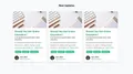
Blog Post Card - Tailwind Template
This is a tailwind component for creating a list of blogs post in card mode. There are thumbnails, authors, blog categories, and subtitles.
card
Loading component...
190 lines
<div class="mx-auto pt-10">
  <div class="text-center">
    <h1 class="font-bold text-2xl">New Updates</h1>
  </div>
  <div class="flex justify-center flex-col md:flex-row gap-10 md:gap-5 pt-10 px-10">
    <div
      class="
        overflow-hidden
        shadow-lg
        transition
        duration-500
        ease-in-out
        transform
        hover:shadow-2xl
        rounded-lg
        md:w-80
      "
    >
      <img
        alt="blog photo"
        src="https://images.unsplash.com/photo-1542435503-956c469947f6?ixlib=rb-1.2.1&ixid=eyJhcHBfaWQiOjEyMDd9&auto=format&fit=crop&w=967&q=80"
        class="max-h-40 w-full object-cover"
      />
      <div class="bg-white w-full p-4">
        <a href="#" class="text-green-600 text-2xl font-medium"
          >Should You Get Online Education?</a
        >
        <p class="text-gray-800 text-sm font-medium mb-2">
          A comprehensive guide about online education.
        </p>
        <p class="text-gray-600 font-light text-md">
          It is difficult to believe that we have become so used to having
          instant access to information at...
          <a class="inline-flex text-green-600" href="#">Read More</a>
        </p>
        <div
          class="
            flex flex-wrap
            justify-starts
            items-center
            py-3
            border-b-2
            text-xs text-white
            font-medium
          "
        >
          <a href="#" class="m-1 px-2 py-1 rounded bg-green-500"> #online </a>
          <a href="#" class="m-1 px-2 py-1 rounded bg-green-500"> #internet </a>
          <a href="#" class="m-1 px-2 py-1 rounded bg-green-500">
            #education
          </a>
        </div>
        <div class="flex items-center mt-2">
          <img
            class="w-10 h-10 object-cover rounded-full"
            alt="User avatar"
            src="https://images.unsplash.com/photo-1477118476589-bff2c5c4cfbb?ixlib=rb-1.2.1&ixid=eyJhcHBfaWQiOjEyMDd9&auto=format&fit=crop&w=200&q=200"
          />
          <div class="pl-2">
            <div class="font-medium">Jean Marc</div>
            <div class="text-gray-600 text-xs">CTO of Supercars</div>
          </div>
        </div>
      </div>
    </div>
  </div>
</div>