Card Features - Tailwind Component
Feature card template that displays features on a website, it is use Tailwind CSS to create this beautiful card tailwind component.
card
Loading component...
80 lines
<div class="container items-center px-4 py-8 m-auto mt-5">
<div class="text-center items-center py-14">
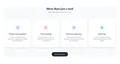
<h2 class="text-gray-800 text-3xl font-bold">More than just a tool</h2>
<p class="mt-2 text-gray-500">Explore what else we can do for you</p>
</div>
<div class="flex flex-wrap pb-3 mx-12 md:mx-24 lg:mx-0">
<div class="w-full p-2 lg:w-1/4 md:w-1/2">
<div class="flex flex-col items-center justify-center text-center px-4 py-16 bg-white rounded-xl shadow-lg
duration-300 hover:bg-gray-50 hover:shadow-2xl group">
<span class="items-center px-4 py-4 mx-auto bg-indigo-50 rounded-full group-hover:bg-indigo-100">
<svg xmlns="http://www.w3.org/2000/svg"
class="items-center w-8 h-8 m-auto text-indigo-500 group-hover:text-indigo-600" fill="none"
viewBox="0 0 24 24" stroke="currentColor">
<path stroke-linecap="round" stroke-linejoin="round" stroke-width="2"
d="M9 5H7a2 2 0 00-2 2v12a2 2 0 002 2h10a2 2 0 002-2V7a2 2 0 00-2-2h-2M9 5a2 2 0 002 2h2a2 2 0 002-2M9 5a2 2 0 012-2h2a2 2 0 012 2" />
</svg>
</span>
<div class="text-xl font-semibold text-gray-700 mt-6">Project management</div>
<div class="text-sm text-gray-500 mt-3 px-4">
Lorem ipsum dolor sit amet consectetur, adipisicing elit. Totam, quidem laudantium.
</div>
</div>
</div>
<div class="w-full p-2 lg:w-1/4 md:w-1/2">
<div class="flex flex-col items-center justify-center text-center px-4 py-16 bg-white rounded-xl shadow-lg
duration-300 hover:bg-gray-50 hover:shadow-2xl group">
<span class="items-center px-4 py-4 mx-auto bg-pink-50 rounded-full group-hover:bg-pink-100">
<svg xmlns="http://www.w3.org/2000/svg"
class="items-center w-8 h-8 m-auto text-pink-500 group-hover:text-pink-600" fill="none" viewBox="0 0 24 24"
stroke="currentColor">
<path stroke-linecap="round" stroke-linejoin="round" stroke-width="2"
d="M12 8v4l3 3m6-3a9 9 0 11-18 0 9 9 0 0118 0z" />
</svg>
</span>
<div class="text-xl font-semibold text-gray-700 mt-6">Time tracking</div>
<div class="text-sm text-gray-500 mt-3 px-4">
Lorem, ipsum dolor sit amet consectetur adipisicing elit. Sit commodi esse.
</div>
</div>
</div>
<div class="w-full p-2 lg:w-1/4 md:w-1/2">
<div class="flex flex-col items-center justify-center text-center px-4 py-16 bg-white rounded-xl shadow-lg
duration-300 hover:bg-gray-50 hover:shadow-2xl group">
<span class="items-center px-4 py-4 mx-auto bg-purple-50 rounded-full group-hover:bg-purple-100">
<svg xmlns="http://www.w3.org/2000/svg"
class="items-center w-8 h-8 m-auto text-purple-500 group-hover:text-purple-600" fill="none"
viewBox="0 0 24 24" stroke="currentColor">
<path stroke-linecap="round" stroke-linejoin="round" stroke-width="2"
d="M8 7V3m8 4V3m-9 8h10M5 21h14a2 2 0 002-2V7a2 2 0 00-2-2H5a2 2 0 00-2 2v12a2 2 0 002 2z" />
</svg>
</span>
<div class="text-xl font-semibold text-gray-700 mt-6">Resource planning</div>
<div class="text-sm text-gray-500 mt-3 px-4">
Lorem ipsum dolor sit amet consectetur adipisicing elit. Expedita quis debitis quo.
</div>
</div>
</div>
<div class="w-full p-2 lg:w-1/4 md:w-1/2">
<div class="flex flex-col items-center justify-center text-center px-4 py-16 bg-white rounded-xl shadow-lg
duration-300 hover:bg-gray-50 hover:shadow-2xl group">
<span class="items-center px-4 py-4 mx-auto bg-green-50 rounded-full group-hover:bg-green-100">
<svg xmlns="http://www.w3.org/2000/svg"
class="items-center w-8 h-8 m-auto text-green-500 group-hover:text-green-600" fill="none"
viewBox="0 0 24 24" stroke="currentColor">
<path stroke-linecap="round" stroke-linejoin="round" stroke-width="2"
d="M12 8c-1.657 0-3 .895-3 2s1.343 2 3 2 3 .895 3 2-1.343 2-3 2m0-8c1.11 0 2.08.402 2.599 1M12 8V7m0 1v8m0 0v1m0-1c-1.11 0-2.08-.402-2.599-1M21 12a9 9 0 11-18 0 9 9 0 0118 0z" />
</svg>
</span>
<div class="text-xl font-semibold text-gray-700 mt-6">Invoicing</div>
<div class="text-sm text-gray-500 mt-3 px-4">
Lorem ipsum dolor sit amet consectetur adipisicing elit. Amet, placeat?
</div>
</div>
</div>
</div>
<button
class="bg-gray-800 text-gray-100 py-3 px-8 font-display rounded-full mx-auto my-8 items-center block transition duration-300 hover:bg-black hover:text-white">View
all features
</button>
</div>