Card Proggres Bar - Tailwind Component
A progress bar is a graphical control element used to visualize the progression of an extended computer operation, such as a download, file transfer, or installation. Sometimes, the graphic is accompanied by a textual representation of the progress in a percent format.
card
Loading component...
73 lines
<div class="flex sm:flex-row flex-col space-y-6 sm:space-x-5 bg-white justify-center mt-12">
<div class="">
<div class="p-12 shadow-lg rounded-lg">
<div class="text-lg mb-4">
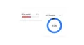
<small class="text-xs font-medium text-gray-400">Your progress</small>
<div class="flex flex-row justify-between items-center">
<h1 class="font-bold text-xl text-gray-700">50% to complete</h1>
<p class="inline-flex text-xs font-medium items-center text-gray-400">
<svg xmlns="http://www.w3.org/2000/svg" class="h-4 w-4 mr-1" viewBox="0 0 20 20" fill="currentColor">
<path fill-rule="evenodd"
d="M10 18a8 8 0 100-16 8 8 0 000 16zm1-12a1 1 0 10-2 0v4a1 1 0 00.293.707l2.828 2.829a1 1 0 101.415-1.415L11 9.586V6z"
clip-rule="evenodd" />
</svg>
22 min</p>
</div>
</div>
<div class="w-80 h-auto bg-gray-100 p-2 rounded-full items-center flex">
<div class="inline-block w-40 h-auto bg-red-500 rounded-full p-2"></div>
</div>
</div>
</div>
<div class="">
<div class="p-12 shadow-lg rounded-lg">
<div class="text-lg mb-4">
<small class="text-xs font-medium text-gray-400">Your progress</small>
<div class="flex flex-row justify-between items-center">
<h1 class="font-bold text-xl text-gray-700">95% to complete</h1>
<p class="inline-flex text-xs font-medium items-center text-gray-400">
<svg xmlns="http://www.w3.org/2000/svg" class="h-4 w-4 mr-1" viewBox="0 0 20 20" fill="currentColor">
<path fill-rule="evenodd"
d="M10 18a8 8 0 100-16 8 8 0 000 16zm1-12a1 1 0 10-2 0v4a1 1 0 00.293.707l2.828 2.829a1 1 0 101.415-1.415L11 9.586V6z"
clip-rule="evenodd" />
</svg>
1 min</p>
</div>
</div>
<div x-data="skillDisplay">
<div class="grid grid-cols-2 gap-6">
<template x-for="skill in skills">
<button x-text="skill.title"
class="px-4 py-2 text-xl text-gray-100 transition bg-blue-600 rounded-md h-14 w-44 hover:bg-blue-700"
:class="(currentSkill.title == skill.title) && 'font-bold ring-2 ring-gray-100'"
@click="currentSkill = skill"></button>
</template>
</div>
<div class="flex items-center justify-center" x-data="{ circumference: 2 * 22 / 7 * 120 }">
<svg class="transform -rotate-90 w-72 h-72">
<circle cx="145" cy="145" r="120" stroke="currentColor" stroke-width="30" fill="transparent"
class="text-gray-700" />
<circle cx="145" cy="145" r="120" stroke="currentColor" stroke-width="30" fill="transparent"
:stroke-dasharray="circumference"
:stroke-dashoffset="circumference - currentSkill.percent / 100 * circumference" class="text-blue-500 " />
</svg>
<span class="absolute text-5xl" x-text="`${currentSkill.percent}%`">95%</span>
</div>
</div>
</div>
</div>
</div>
<script defer src="https://unpkg.com/[email protected]/dist/cdn.min.js"></script>
<script>
document.addEventListener('alpine:init', () => {
Alpine.data('skillDisplay', () => ({
currentSkill: {
'title': 'HTML',
'percent': '95',
}
}));
});
</script>