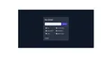
Crafting a Dynamic Stay Update Form Using Tailwind UI
Stay up to date with the latest information through an engaging email layout crafted using the design sophistication of Tailwind CSS.
forms
Loading component...
59 lines
<link rel="preconnect" href="https://fonts.googleapis.com">
<link rel="preconnect" href="https://fonts.gstatic.com" crossorigin>
<link
  href="https://fonts.googleapis.com/css2?family=Plus+Jakarta+Sans:ital,wght@0,200;0,300;0,400;0,500;0,600;0,700;0,800;1,200;1,300;1,400;1,500;1,600;1,700;1,800&display=swap"
  rel="stylesheet">

<style>
  .body {
    font-family: 'Plus Jakarta Sans', sans-serif;
  }
</style>

<div class="bg-gray-900 min-h-screen flex items-center justify-center w-full">
  <div class="rounded-lg border border-white border-opacity-40 shadow p-4 sm:p-6 mx-4 xl:w-2/6 md:w-3/6 w-full relative overlow-hidden bg-gray-400 bg-opacity-20">
    <h2 class="text-2xl font-semibold mb-8 text-white">Stay Updated</h2>
    <form action="" class="flex items-center justify-between w-full mb-8 ">
      <div class="flex flex-wrap items-center w-full">
        <input type="email"
          class="w-full px-4 py-2 border rounded-lg focus:outline-none focus:ring focus:border-blue-300 mr-2"
          placeholder="Enter your email address">
      </div>
      <button class="px-4 py-2.5 rounded-md bg-indigo-700 text-gray-100 hover:bg-indigo-900">Subscribe</button>
    </form>

    <div class="grid grid-rows-3  grid-flow-col gap-2 px-4 mb-8">
      <div class="flex items-center mb-4">
        <input id="default-checkbox1" type="checkbox" value=""
          class="w-4 h-4 text-blue-600 bg-gray-100 border-gray-300 rounded focus:ring-blue-500 dark:focus:ring-blue-600 dark:ring-offset-gray-800 focus:ring-2 dark:bg-gray-700 dark:border-gray-600">
        <label for="default-checkbox1" class="ml-2 text-sm font-medium dark:text-gray-300 text-gray-100">News</label>
      </div>
      <div class="flex items-center mb-4">
        <input id="default-checkbox2" type="checkbox" value=""
          class="w-4 h-4 text-blue-600 bg-gray-100 border-gray-300 rounded focus:ring-blue-500 dark:focus:ring-blue-600 dark:ring-offset-gray-800 focus:ring-2 dark:bg-gray-700 dark:border-gray-600">
        <label for="default-checkbox2" class="ml-2 text-sm font-medium dark:text-gray-300 text-gray-100">Quarterly Reports</label>
      </div>
      <div class="flex items-center mb-4">
        <input id="default-checkbox3" type="checkbox" value=""
          class="w-4 h-4 text-blue-600 bg-gray-100 border-gray-300 rounded focus:ring-blue-500 dark:focus:ring-blue-600 dark:ring-offset-gray-800 focus:ring-2 dark:bg-gray-700 dark:border-gray-600">
        <label for="default-checkbox3" class="ml-2 text-sm font-medium dark:text-gray-300 text-gray-100">Articles</label>
      </div>
      <div class="flex items-center mb-4">
        <input id="default-checkbox4" type="checkbox" value=""
          class="w-4 h-4 text-blue-600 bg-gray-100 border-gray-300 rounded focus:ring-blue-500 dark:focus:ring-blue-600 dark:ring-offset-gray-800 focus:ring-2 dark:bg-gray-700 dark:border-gray-600">
        <label for="default-checkbox4" class="ml-2 text-sm font-medium dark:text-gray-300 text-gray-100">Event & Workshops</label>
      </div>
      <div class="flex items-center mb-4">
        <input id="default-checkbox5" type="checkbox" value=""
          class="w-4 h-4 text-blue-600 bg-gray-100 border-gray-300 rounded focus:ring-blue-500 dark:focus:ring-blue-600 dark:ring-offset-gray-800 focus:ring-2 dark:bg-gray-700 dark:border-gray-600">
        <label for="default-checkbox5" class="ml-2 text-sm font-medium dark:text-gray-300 text-gray-100">Annual Reports</label>
      </div>
      <div class="flex items-center mb-4">
        <input id="default-checkbox6" type="checkbox" value=""
          class="w-4 h-4 text-blue-600 bg-gray-100 border-gray-300 rounded focus:ring-blue-500 dark:focus:ring-blue-600 dark:ring-offset-gray-800 focus:ring-2 dark:bg-gray-700 dark:border-gray-600">
        <label for="default-checkbox6" class="ml-2 text-sm font-medium dark:text-gray-300 text-gray-100">Seminar & Courses</label>
      </div>
    </div>
    <a href="" class="underline text-sm font-medium text-indigo-200 hover:text-indigo-50">Unsubcribe</a>
  </div>
</div>