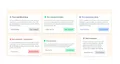
Dialog Popup Using Tailwind UI
A dialog popup created with Tailwind provides a sleek and user-friendly overlay for displaying additional information, alerts, or interactive content, enhancing the user experience on your website or application.
modal
Loading component...
203 lines
<link rel="preconnect" href="https://fonts.googleapis.com">
<link rel="preconnect" href="https://fonts.gstatic.com" crossorigin>
<link
    href="https://fonts.googleapis.com/css2?family=Plus+Jakarta+Sans:ital,wght@0,200;0,300;0,400;0,500;0,600;0,700;0,800;1,200;1,300;1,400;1,500;1,600;1,700;1,800&display=swap"
    rel="stylesheet">

<style>
    body {
        font-family: 'Plus Jakarta Sans', sans-serif;
    }
</style>

<!-- inspired design by https://dribbble.com/shots/14323371-Figma-UI-kit-React-design-system-Dialog-popup-template -->
<section class="flex items-center justify-center bg-[#FFF6ED]">
    <div class="grid grid-flow-col grid-rows-6 gap-4 px-8 pt-12 md:grid-rows-3 xl:grid-rows-2">
        <div class="flex items-center justify-center">
            <div class="p-6 bg-white shadow-lg rounded-xl">
                <div class="w-96">
                    <div class="flex items-center">
                        <svg xmlns="http://www.w3.org/2000/svg" viewBox="0 0 24 24" fill="currentColor"
                            class="w-6 h-6 mr-2 text-gray-400 fill-current">
                            <path fill-rule="evenodd"
                                d="M2.25 12c0-5.385 4.365-9.75 9.75-9.75s9.75 4.365 9.75 9.75-4.365 9.75-9.75 9.75S2.25 17.385 2.25 12zm8.706-1.442c1.146-.573 2.437.463 2.126 1.706l-.709 2.836.042-.02a.75.75 0 01.67 1.34l-.04.022c-1.147.573-2.438-.463-2.127-1.706l.71-2.836-.042.02a.75.75 0 11-.671-1.34l.041-.022zM12 9a.75.75 0 100-1.5.75.75 0 000 1.5z"
                                clip-rule="evenodd" />
                        </svg>
                        <h3 class="font-bold text-gray-900">This is raised default dialog</h3>
                    </div>
                    <p class="py-4 text-sm text-gray-600">
                        First you need import component to your code. To
                        use the component, copy and paste an example
                        from the CODE tab. Default props of component
                        can be omitted, they are applied automatically.
                    </p>
                </div>

                <div class="flex justify-between w-full">
                    <a href="#" class="px-4 py-2.5 text-center text-gray-700 hover:text-gray-500 font-medium text-sm">
                        Maybe This Time</a>
                    <a href="#"
                        class="px-4 py-2.5 text-center text-gray-700 bg-gray-200 rounded hover:bg-gray-900 hover:text-gray-50 font-semibold text-sm">
                        Sure, Continue!
                    </a>
                </div>
            </div>
        </div>

        <div class="flex items-center justify-center">
            <div class="p-6 bg-white shadow-lg rounded-xl">
                <div class="w-96">
                    <div class="flex items-center">
                        <svg xmlns="http://www.w3.org/2000/svg" viewBox="0 0 24 24" fill="currentColor"
                            class="w-6 h-6 mr-2 text-red-400 fill-current">
                            <path fill-rule="evenodd"
                                d="M2.25 12c0-5.385 4.365-9.75 9.75-9.75s9.75 4.365 9.75 9.75-4.365 9.75-9.75 9.75S2.25 17.385 2.25 12zm8.706-1.442c1.146-.573 2.437.463 2.126 1.706l-.709 2.836.042-.02a.75.75 0 01.67 1.34l-.04.022c-1.147.573-2.438-.463-2.127-1.706l.71-2.836-.042.02a.75.75 0 11-.671-1.34l.041-.022zM12 9a.75.75 0 100-1.5.75.75 0 000 1.5z"
                                clip-rule="evenodd" />
                        </svg>
                        <h3 class="font-bold text-red-900">Start using UI kits - Save your time</h3>
                    </div>
                    <p class="py-4 text-sm text-gray-600">
                        First you need import component to your code. To use the
                        component, copy and paste an example from the CODE tab.
                        Default props of component can be omitted, they are applied
                        automatically.
                    </p>
                </div>

                <div class="flex justify-between w-full">
                    <a href="#" class="px-4 py-2.5 text-center text-red-700 hover:text-red-500 font-medium text-sm">
                        Yes, purchase
                    </a>
                    <a href="#"
                        class="px-4 py-2.5 text-center text-red-700 bg-red-200 rounded hover:bg-red-900 hover:text-red-50 font-semibold text-sm">
                        Business License
                    </a>
                </div>
            </div>
        </div>

        <div class="flex items-center justify-center">
            <div class="p-6 bg-white shadow-lg rounded-xl">
                <div class="w-96">
                    <div class="flex items-center">
                        <svg xmlns="http://www.w3.org/2000/svg" viewBox="0 0 24 24" fill="currentColor"
                            class="w-6 h-6 mr-2 text-green-400 fill-current">
                            <path fill-rule="evenodd"
                                d="M2.25 12c0-5.385 4.365-9.75 9.75-9.75s9.75 4.365 9.75 9.75-4.365 9.75-9.75 9.75S2.25 17.385 2.25 12zm8.706-1.442c1.146-.573 2.437.463 2.126 1.706l-.709 2.836.042-.02a.75.75 0 01.67 1.34l-.04.022c-1.147.573-2.438-.463-2.127-1.706l.71-2.836-.042.02a.75.75 0 11-.671-1.34l.041-.022zM12 9a.75.75 0 100-1.5.75.75 0 000 1.5z"
                                clip-rule="evenodd" />
                        </svg>
                        <h3 class="font-bold text-green-900">This is raised positive dialog</h3>
                    </div>
                    <p class="py-4 text-sm text-gray-600">
                        First you need import component to your code. To
                        use the component, copy and paste an example
                        from the CODE tab. Default props of component
                        can be omitted, they are applied automatically.
                    </p>
                </div>

                <div class="flex justify-between w-full">
                    <a href="#" class="px-4 py-2.5 text-center text-green-700 hover:text-green-500 font-medium text-sm">
                        Maybe This Time</a>
                    <a href="#"
                        class="px-4 py-2.5 text-center text-green-700 bg-green-200 rounded hover:bg-green-900 hover:text-green-50 font-semibold text-sm">
                        Sure, Continue!
                    </a>
                </div>
            </div>
        </div>

        <div class="flex items-center justify-center">
            <div class="p-4 bg-white shadow-lg rounded-xl">
                <div class="">
                    <div class="flex items-center">
                        <svg xmlns="http://www.w3.org/2000/svg" viewBox="0 0 24 24" fill="currentColor"
                            class="w-6 h-6 mr-2 text-green-400 fill-current">
                            <path fill-rule="evenodd"
                                d="M2.25 12c0-5.385 4.365-9.75 9.75-9.75s9.75 4.365 9.75 9.75-4.365 9.75-9.75 9.75S2.25 17.385 2.25 12zm8.706-1.442c1.146-.573 2.437.463 2.126 1.706l-.709 2.836.042-.02a.75.75 0 01.67 1.34l-.04.022c-1.147.573-2.438-.463-2.127-1.706l.71-2.836-.042.02a.75.75 0 11-.671-1.34l.041-.022zM12 9a.75.75 0 100-1.5.75.75 0 000 1.5z"
                                clip-rule="evenodd" />
                        </svg>
                        <h3 class="text-sm font-bold text-green-900">This is raised dense</h3>
                    </div>
                    <p class="py-4 text-xs text-gray-600">
                        First you need import component to your code. To
                        use the component, copy and paste an example
                        from the CODE tab. Default props of component
                        can be omitted, they are applied automatically.
                    </p>
                </div>

                <div class="flex justify-between w-full">
                    <a href="#" class="px-4 py-2.5 text-center text-green-700 hover:text-green-500 font-medium text-xs">
                        Maybe This Time</a>
                    <a href="#"
                        class="px-4 py-2.5 text-center text-green-700 bg-green-200 rounded hover:bg-green-900 hover:text-green-50 font-semibold text-xs">
                        Sure, Continue!
                    </a>
                </div>
            </div>
        </div>

        <div class="flex items-center justify-center">
            <div class="p-6 bg-white shadow-lg rounded-xl">
                <div class="w-96">
                    <div class="flex items-center">
                        <svg xmlns="http://www.w3.org/2000/svg" viewBox="0 0 24 24" fill="currentColor"
                            class="w-6 h-6 mr-2 text-blue-400 fill-current">
                            <path fill-rule="evenodd"
                                d="M2.25 12c0-5.385 4.365-9.75 9.75-9.75s9.75 4.365 9.75 9.75-4.365 9.75-9.75 9.75S2.25 17.385 2.25 12zm8.706-1.442c1.146-.573 2.437.463 2.126 1.706l-.709 2.836.042-.02a.75.75 0 01.67 1.34l-.04.022c-1.147.573-2.438-.463-2.127-1.706l.71-2.836-.042.02a.75.75 0 11-.671-1.34l.041-.022zM12 9a.75.75 0 100-1.5.75.75 0 000 1.5z"
                                clip-rule="evenodd" />
                        </svg>
                        <h3 class="font-bold text-blue-900">This is raised primary dialog</h3>
                    </div>
                    <p class="py-4 text-sm text-gray-600">
                        First you need import component to your code. To
                        use the component, copy and paste an example
                        from the CODE tab. Default props of component
                        can be omitted, they are applied automatically.
                    </p>
                </div>

                <div class="flex justify-between w-full">
                    <a href="#" class="px-4 py-2.5 text-center text-blue-700 hover:text-blue-500 font-medium text-sm">
                        Maybe This Time</a>
                    <a href="#"
                        class="px-4 py-2.5 text-center text-blue-700 bg-blue-200 rounded hover:bg-blue-900 hover:text-blue-50 font-semibold text-sm">
                        Sure, Continue!
                    </a>
                </div>
            </div>
        </div>

        <div class="flex items-center justify-center">
            <div class="p-6 bg-white shadow-lg rounded-xl">
                <div class="w-72">
                    <div class="flex items-center">
                        <svg xmlns="http://www.w3.org/2000/svg" viewBox="0 0 24 24" fill="currentColor"
                            class="w-6 h-6 mr-2 text-gray-400 fill-current">
                            <path fill-rule="evenodd"
                                d="M2.25 12c0-5.385 4.365-9.75 9.75-9.75s9.75 4.365 9.75 9.75-4.365 9.75-9.75 9.75S2.25 17.385 2.25 12zm8.706-1.442c1.146-.573 2.437.463 2.126 1.706l-.709 2.836.042-.02a.75.75 0 01.67 1.34l-.04.022c-1.147.573-2.438-.463-2.127-1.706l.71-2.836-.042.02a.75.75 0 11-.671-1.34l.041-.022zM12 9a.75.75 0 100-1.5.75.75 0 000 1.5z"
                                clip-rule="evenodd" />
                        </svg>
                        <h3 class="font-bold text-gray-900">This is raised dense</h3>
                    </div>
                    <p class="py-4 text-sm text-gray-600">
                        First you need import component to your code. To
                        use the component, copy and paste an example
                        from the CODE tab. Default props of component
                        can be omitted, they are applied automatically.
                    </p>
                </div>

                <div class="flex justify-between w-full">
                    <a href="#" class="px-4 py-2.5 text-center text-gray-700 hover:text-gray-500 font-medium text-sm">
                        Maybe This Time</a>
                    <a href="#"
                        class="px-4 py-2.5 text-center text-gray-700 bg-gray-200 rounded hover:bg-gray-900 hover:text-gray-50 font-semibold text-sm">
                        Sure, Continue!
                    </a>
                </div>
            </div>
        </div>
    </div>
</section>