Modal Form Template - Tailwind Component
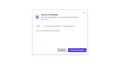
Modal forms are displayed-on-action pop-up forms that are used for gathering data from website visitors, it is use Tailwind CSS to create this beautiful modal form tailwind component.
modal
Loading component...
102 lines
<div class="flex items-center justify-center h-screen">
  <button class="inline-flex items-center modal-open px-6 py-3 text-xl font-semibold text-red-600 hover:text-white
  bg-white hover:bg-red-600 border-2 border-red-500 rounded-full focus:outline-none dark:border-gray-50 dark:bg-gray-800
  dark:text-gray-100 dark:hover:bg-gray-700 dark:hover:text-gray-50 ">
  <svg xmlns="http://www.w3.org/2000/svg" class="h-6 w-6 mr-2" fill="none" viewBox="0 0 24 24" stroke="currentColor">
    <path stroke-linecap="round" stroke-linejoin="round" stroke-width="2" d="M12 9v3m0 0v3m0-3h3m-3 0H9m12 0a9 9 0 11-18 0 9 9 0 0118 0z" />
  </svg>
    New template
  </button>
  <div class="modal opacity-0 pointer-events-none fixed w-full h-full top-0 left-0 flex items-center justify-center">
    <div class="modal-overlay absolute w-full h-full bg-gray-300 opacity-50"></div>
    <div
      class="modal-container bg-gradient-to-r bg-white max-w-lg mx-auto rounded shadow-lg z-50 overflow-y-auto dark:bg-gray-800">
      <div class="modal-content py-4 text-left px-2">
        <div class="flex flex-row justify-between items-center pb-3">
          <div class="flex flex-row">
            <div class="flex flex-1 items-center p-4">
              <div
                class="flex flex-col w-10 h-10 justify-center items-center mr-4 text-indigo-700 bg-indigo-200 rounded dark:text-gray-800 dark:bg-orange-50">
                <svg xmlns="http://www.w3.org/2000/svg" class="h-6 w-6" viewBox="0 0 20 20" fill="currentColor">
                  <path d="M7 9a2 2 0 012-2h6a2 2 0 012 2v6a2 2 0 01-2 2H9a2 2 0 01-2-2V9z" />
                  <path d="M5 3a2 2 0 00-2 2v6a2 2 0 002 2V5h8a2 2 0 00-2-2H5z" />
                </svg>
              </div>
              <div class="flex-1">
                <div class="font-semibold text-base text-gray-800 dark:text-gray-100">Save as a template</div>
                <div class="text-gray-600 text-sm dark:text-gray-200">Save this workspace so you can easily duplicate in
                  the future.</div>
              </div>
            </div>
          </div>
          <div class="modal-close cursor-pointer z-50 p-2 -mt-20">
            <svg xmlns="http://www.w3.org/2000/svg"
              class="h-6 w-6 text-gray-400 hover:text-gray-500 dark:text-gray-300 dark:hover:text-gray-100" fill="none"
              viewBox="0 0 24 24" stroke="currentColor">
              <path stroke-linecap="round" stroke-linejoin="round" stroke-width="2" d="M6 18L18 6M6 6l12 12" />
            </svg>
          </div>
        </div>
        <hr>
        <form action="#">
          <span class="flex">
            <span class="w-28 text-sm font-medium text-center text-gray-600 p-3 px-2 dark:text-gray-200">Title</span>
            <input
              class="field text-sm text-gray-600 p-2 pr-8 w-full border-transparent focus:border-transparent focus:ring-0 focus:outline-none dark:bg-gray-800 dark:text-gray-200"
              type="text" placeholder="Name your template, i.e. Design proposal">
          </span>
          <hr>
          <textarea class=" px-6 w-full text-sm h-36 outline-none border-transparent focus:border-transparent focus:ring-0  dark:bg-gray-800 dark:text-gray-200"
            spellcheck="false" placeholder="Add extra description (Optional)"></textarea>
          <hr>
        </form>
        <div class="flex-row md:flex items-center float-right">
          <div class="space-y-2 sm:space-x-2 my-5">
            <button
              class="modal-close px-5 py-2 bg-gray-300 rounded-sm text-gray-600 text-sm font-medium hover:bg-gray-800  hover:text-gray-100 focus:outline-none dark:hover:bg-gray-100 dark:hover:text-gray-800">
              Cancel
            </button>
            <button
              class="modal-close px-5 py-2 bg-indigo-600 rounded-sm text-gray-200  text-sm font-medium hover:bg-indigo-700  hover:text-gray-100 focus:outline-none dark:text-gray-100 dark:bg-gray-600 dark:hover:text-gray-50 dark:hover:bg-gray-700">
              Save this template
            </button>
          </div>
        </div>
      </div>
    </div>
  </div>
</div>

<style>
  @import url('https://fonts.googleapis.com/css2?family=Poppins:wght@400;500;600;700;800&display=swap');

  body {
    font-family: 'Poppins', sans-serif;
  }
</style>

<script>
  var openmodal = document.querySelectorAll('.modal-open')
  for (var i = 0; i < openmodal.length; i++) {
    openmodal[i].addEventListener('click', function (event) {
      event.preventDefault()
      toggleModal()
    })
  }

  const overlay = document.querySelector('.modal-overlay')
  overlay.addEventListener('click', toggleModal)

  var closemodal = document.querySelectorAll('.modal-close')
  for (var i = 0; i < closemodal.length; i++) {
    closemodal[i].addEventListener('click', toggleModal)
  }

  function toggleModal() {
    const body = document.querySelector('body')
    const modal = document.querySelector('.modal')
    modal.classList.toggle('opacity-0')
    modal.classList.toggle('pointer-events-none')
    body.classList.toggle('modal-active')
  }
</script>