Modern Card Slider Using Tailwind UI
A modern card slider component built with Tailwind CSS featuring smooth animations, responsive design, and intuitive navigation controls. Perfect for showcasing products, testimonials, or featured content with a professional touch.
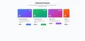
slider card
Loading component...
378 lines
<!DOCTYPE html>
<html lang="en">
<head>
<meta charset="UTF-8">
<meta name="viewport" content="width=device-width, initial-scale=1.0">
<title>Modern Card Slider</title>
<script src="https://cdn.tailwindcss.com"></script>
<link rel="preconnect" href="https://fonts.googleapis.com">
<link rel="preconnect" href="https://fonts.gstatic.com" crossorigin>
<link href="https://fonts.googleapis.com/css2?family=Inter:wght@300;400;500;600;700&display=swap" rel="stylesheet">
<style>
body {
font-family: 'Inter', sans-serif;
}
.card-slider {
scroll-behavior: smooth;
}
.card {
transition: all 0.3s ease;
}
.card:hover {
transform: translateY(-8px);
}
.scroll-snap-x {
scroll-snap-type: x mandatory;
}
.scroll-snap-center {
scroll-snap-align: center;
}
</style>
</head>
<body class="bg-gray-50 min-h-screen py-12">
<div class="max-w-7xl mx-auto px-4 sm:px-6 lg:px-8">
<!-- Header Section -->
<div class="text-center mb-12">
<h1 class="text-4xl font-bold text-gray-900 mb-4">Featured Products</h1>
<p class="text-lg text-gray-600 max-w-2xl mx-auto">
Discover our carefully curated collection of premium products designed to enhance your lifestyle
</p>
</div>
<!-- Card Slider Container -->
<div class="relative">
<!-- Navigation Buttons -->
<button id="prevBtn"
class="absolute left-0 top-1/2 -translate-y-1/2 z-10 bg-white hover:bg-gray-50 text-gray-700 p-3 rounded-full shadow-lg border transition-all duration-200 hover:scale-105 disabled:opacity-50 disabled:cursor-not-allowed">
<svg class="w-5 h-5" fill="none" stroke="currentColor" viewBox="0 0 24 24">
<path stroke-linecap="round" stroke-linejoin="round" stroke-width="2" d="M15 19l-7-7 7-7"></path>
</svg>
</button>
<button id="nextBtn"
class="absolute right-0 top-1/2 -translate-y-1/2 z-10 bg-white hover:bg-gray-50 text-gray-700 p-3 rounded-full shadow-lg border transition-all duration-200 hover:scale-105 disabled:opacity-50 disabled:cursor-not-allowed">
<svg class="w-5 h-5" fill="none" stroke="currentColor" viewBox="0 0 24 24">
<path stroke-linecap="round" stroke-linejoin="round" stroke-width="2" d="M9 5l7 7-7 7"></path>
</svg>
</button>
<!-- Cards Container -->
<div id="cardSlider" class="flex overflow-x-auto scroll-snap-x gap-6 pb-4 px-12 card-slider scrollbar-hide">
<!-- Card 1 -->
<div class="card flex-none w-80 bg-white rounded-2xl shadow-md scroll-snap-center">
<div class="h-48 bg-gradient-to-br from-blue-500 to-purple-600 rounded-t-2xl relative">
<div
class="absolute top-4 right-4 bg-white/20 backdrop-blur-sm text-white px-3 py-1 rounded-full text-sm font-medium">
New
</div>
<div class="absolute bottom-4 left-4 text-white">
<div
class="w-12 h-12 bg-white/20 backdrop-blur-sm rounded-xl flex items-center justify-center">
<svg class="w-6 h-6" fill="currentColor" viewBox="0 0 20 20">
<path
d="M3 4a1 1 0 011-1h12a1 1 0 011 1v2a1 1 0 01-1 1H4a1 1 0 01-1-1V4zM3 10a1 1 0 011-1h6a1 1 0 011 1v6a1 1 0 01-1 1H4a1 1 0 01-1-1v-6zM14 9a1 1 0 00-1 1v6a1 1 0 001 1h2a1 1 0 001-1v-6a1 1 0 00-1-1h-2z" />
</svg>
</div>
</div>
</div>
<div class="p-6">
<h3 class="text-xl font-semibold text-gray-900 mb-2">Premium Dashboard</h3>
<p class="text-gray-600 mb-4 text-sm leading-relaxed">
A comprehensive dashboard solution with advanced analytics and beautiful visualizations.
</p>
<div class="flex items-center justify-between">
<div class="flex items-center space-x-2">
<span class="text-2xl font-bold text-gray-900">$99</span>
<span class="text-sm text-gray-500 line-through">$149</span>
</div>
<button
class="bg-blue-600 hover:bg-blue-700 text-white px-4 py-2 rounded-lg text-sm font-medium transition-colors">
Get Started
</button>
</div>
</div>
</div>
<!-- Card 2 -->
<div class="card flex-none w-80 bg-white rounded-2xl shadow-md scroll-snap-center">
<div class="h-48 bg-gradient-to-br from-green-500 to-teal-600 rounded-t-2xl relative">
<div
class="absolute top-4 right-4 bg-white/20 backdrop-blur-sm text-white px-3 py-1 rounded-full text-sm font-medium">
Popular
</div>
<div class="absolute bottom-4 left-4 text-white">
<div
class="w-12 h-12 bg-white/20 backdrop-blur-sm rounded-xl flex items-center justify-center">
<svg class="w-6 h-6" fill="currentColor" viewBox="0 0 20 20">
<path fill-rule="evenodd"
d="M6.267 3.455a3.066 3.066 0 001.745-.723 3.066 3.066 0 013.976 0 3.066 3.066 0 001.745.723 3.066 3.066 0 012.812 2.812c.051.643.304 1.254.723 1.745a3.066 3.066 0 010 3.976 3.066 3.066 0 00-.723 1.745 3.066 3.066 0 01-2.812 2.812 3.066 3.066 0 00-1.745.723 3.066 3.066 0 01-3.976 0 3.066 3.066 0 00-1.745-.723 3.066 3.066 0 01-2.812-2.812 3.066 3.066 0 00-.723-1.745 3.066 3.066 0 010-3.976 3.066 3.066 0 00.723-1.745 3.066 3.066 0 012.812-2.812zm7.44 5.252a1 1 0 00-1.414-1.414L9 10.586 7.707 9.293a1 1 0 00-1.414 1.414l2 2a1 1 0 001.414 0l4-4z"
clip-rule="evenodd" />
</svg>
</div>
</div>
</div>
<div class="p-6">
<h3 class="text-xl font-semibold text-gray-900 mb-2">E-commerce Suite</h3>
<p class="text-gray-600 mb-4 text-sm leading-relaxed">
Complete e-commerce solution with inventory management and payment processing.
</p>
<div class="flex items-center justify-between">
<div class="flex items-center space-x-2">
<span class="text-2xl font-bold text-gray-900">$199</span>
<span class="text-sm text-gray-500 line-through">$299</span>
</div>
<button
class="bg-green-600 hover:bg-green-700 text-white px-4 py-2 rounded-lg text-sm font-medium transition-colors">
Choose Plan
</button>
</div>
</div>
</div>
<!-- Card 3 -->
<div class="card flex-none w-80 bg-white rounded-2xl shadow-md scroll-snap-center">
<div class="h-48 bg-gradient-to-br from-purple-500 to-pink-600 rounded-t-2xl relative">
<div
class="absolute top-4 right-4 bg-white/20 backdrop-blur-sm text-white px-3 py-1 rounded-full text-sm font-medium">
Featured
</div>
<div class="absolute bottom-4 left-4 text-white">
<div
class="w-12 h-12 bg-white/20 backdrop-blur-sm rounded-xl flex items-center justify-center">
<svg class="w-6 h-6" fill="currentColor" viewBox="0 0 20 20">
<path
d="M9.049 2.927c.3-.921 1.603-.921 1.902 0l1.07 3.292a1 1 0 00.95.69h3.462c.969 0 1.371 1.24.588 1.81l-2.8 2.034a1 1 0 00-.364 1.118l1.07 3.292c.3.921-.755 1.688-1.54 1.118l-2.8-2.034a1 1 0 00-1.175 0l-2.8 2.034c-.784.57-1.838-.197-1.539-1.118l1.07-3.292a1 1 0 00-.364-1.118L2.98 8.72c-.783-.57-.38-1.81.588-1.81h3.461a1 1 0 00.951-.69l1.07-3.292z" />
</svg>
</div>
</div>
</div>
<div class="p-6">
<h3 class="text-xl font-semibold text-gray-900 mb-2">Analytics Pro</h3>
<p class="text-gray-600 mb-4 text-sm leading-relaxed">
Advanced analytics platform with real-time data visualization and insights.
</p>
<div class="flex items-center justify-between">
<div class="flex items-center space-x-2">
<span class="text-2xl font-bold text-gray-900">$299</span>
<span class="text-sm text-gray-500 line-through">$399</span>
</div>
<button
class="bg-purple-600 hover:bg-purple-700 text-white px-4 py-2 rounded-lg text-sm font-medium transition-colors">
Upgrade Now
</button>
</div>
</div>
</div>
<!-- Card 4 -->
<div class="card flex-none w-80 bg-white rounded-2xl shadow-md scroll-snap-center">
<div class="h-48 bg-gradient-to-br from-orange-500 to-red-600 rounded-t-2xl relative">
<div
class="absolute top-4 right-4 bg-white/20 backdrop-blur-sm text-white px-3 py-1 rounded-full text-sm font-medium">
Limited
</div>
<div class="absolute bottom-4 left-4 text-white">
<div
class="w-12 h-12 bg-white/20 backdrop-blur-sm rounded-xl flex items-center justify-center">
<svg class="w-6 h-6" fill="currentColor" viewBox="0 0 20 20">
<path fill-rule="evenodd"
d="M3 3a1 1 0 000 2v8a2 2 0 002 2h2.586l-1.293 1.293a1 1 0 101.414 1.414L10 15.414l2.293 2.293a1 1 0 001.414-1.414L12.414 15H15a2 2 0 002-2V5a1 1 0 100-2H3zm11.707 4.707a1 1 0 00-1.414-1.414L10 9.586 8.707 8.293a1 1 0 00-1.414 1.414l2 2a1 1 0 001.414 0l4-4z"
clip-rule="evenodd" />
</svg>
</div>
</div>
</div>
<div class="p-6">
<h3 class="text-xl font-semibold text-gray-900 mb-2">Enterprise Solution</h3>
<p class="text-gray-600 mb-4 text-sm leading-relaxed">
Complete enterprise package with custom integrations and dedicated support.
</p>
<div class="flex items-center justify-between">
<div class="flex items-center space-x-2">
<span class="text-2xl font-bold text-gray-900">$599</span>
<span class="text-sm text-gray-500 line-through">$799</span>
</div>
<button
class="bg-orange-600 hover:bg-orange-700 text-white px-4 py-2 rounded-lg text-sm font-medium transition-colors">
Contact Sales
</button>
</div>
</div>
</div>
<!-- Card 5 -->
<div class="card flex-none w-80 bg-white rounded-2xl shadow-md scroll-snap-center">
<div class="h-48 bg-gradient-to-br from-cyan-500 to-blue-600 rounded-t-2xl relative">
<div
class="absolute top-4 right-4 bg-white/20 backdrop-blur-sm text-white px-3 py-1 rounded-full text-sm font-medium">
Free Trial
</div>
<div class="absolute bottom-4 left-4 text-white">
<div
class="w-12 h-12 bg-white/20 backdrop-blur-sm rounded-xl flex items-center justify-center">
<svg class="w-6 h-6" fill="currentColor" viewBox="0 0 20 20">
<path fill-rule="evenodd"
d="M10 18a8 8 0 100-16 8 8 0 000 16zM8.707 7.293a1 1 0 00-1.414 1.414L8.586 10l-1.293 1.293a1 1 0 101.414 1.414L10 11.414l1.293 1.293a1 1 0 001.414-1.414L11.414 10l1.293-1.293a1 1 0 00-1.414-1.414L10 8.586 8.707 7.293z"
clip-rule="evenodd" />
</svg>
</div>
</div>
</div>
<div class="p-6">
<h3 class="text-xl font-semibold text-gray-900 mb-2">Starter Package</h3>
<p class="text-gray-600 mb-4 text-sm leading-relaxed">
Perfect for small teams and startups looking to get started with our platform.
</p>
<div class="flex items-center justify-between">
<div class="flex items-center space-x-2">
<span class="text-2xl font-bold text-gray-900">$49</span>
<span class="text-sm text-gray-500 line-through">$79</span>
</div>
<button
class="bg-cyan-600 hover:bg-cyan-700 text-white px-4 py-2 rounded-lg text-sm font-medium transition-colors">
Start Free
</button>
</div>
</div>
</div>
</div>
<!-- Indicators -->
<div class="flex justify-center mt-8 space-x-2" id="indicators">
<!-- Dynamic indicators will be inserted here -->
</div>
</div>
</div>
<script>
class CardSlider {
constructor() {
this.slider = document.getElementById('cardSlider');
this.prevBtn = document.getElementById('prevBtn');
this.nextBtn = document.getElementById('nextBtn');
this.indicatorsContainer = document.getElementById('indicators');
this.currentIndex = 0;
this.cardWidth = 320; // Card width + gap
this.visibleCards = this.getVisibleCards();
this.totalCards = this.slider.children.length;
this.maxIndex = Math.max(0, this.totalCards - this.visibleCards);
this.init();
}
getVisibleCards() {
const containerWidth = this.slider.parentElement.clientWidth - 96; // Account for padding
return Math.floor(containerWidth / this.cardWidth);
}
init() {
this.createIndicators();
this.updateButtons();
this.bindEvents();
window.addEventListener('resize', () => {
this.visibleCards = this.getVisibleCards();
this.maxIndex = Math.max(0, this.totalCards - this.visibleCards);
this.updateButtons();
});
}
createIndicators() {
this.indicatorsContainer.innerHTML = '';
const indicatorCount = Math.ceil(this.totalCards / this.visibleCards);
for (let i = 0; i < indicatorCount; i++) {
const indicator = document.createElement('button');
indicator.className = `w-3 h-3 rounded-full transition-colors ${i === 0 ? 'bg-blue-600' : 'bg-gray-300'}`;
indicator.addEventListener('click', () => this.goToSlide(i * this.visibleCards));
this.indicatorsContainer.appendChild(indicator);
}
}
updateIndicators() {
const indicators = this.indicatorsContainer.children;
const activeIndicator = Math.floor(this.currentIndex / this.visibleCards);
for (let i = 0; i < indicators.length; i++) {
indicators[i].className = `w-3 h-3 rounded-full transition-colors ${i === activeIndicator ? 'bg-blue-600' : 'bg-gray-300'}`;
}
}
updateButtons() {
this.prevBtn.disabled = this.currentIndex === 0;
this.nextBtn.disabled = this.currentIndex >= this.maxIndex;
}
goToSlide(index) {
this.currentIndex = Math.max(0, Math.min(index, this.maxIndex));
const scrollPosition = this.currentIndex * this.cardWidth;
this.slider.scrollTo({
left: scrollPosition,
behavior: 'smooth'
});
this.updateButtons();
this.updateIndicators();
}
prev() {
this.goToSlide(this.currentIndex - 1);
}
next() {
this.goToSlide(this.currentIndex + 1);
}
bindEvents() {
this.prevBtn.addEventListener('click', () => this.prev());
this.nextBtn.addEventListener('click', () => this.next());
// Touch/swipe support
let startX = 0;
let scrollLeft = 0;
this.slider.addEventListener('touchstart', (e) => {
startX = e.touches[0].pageX - this.slider.offsetLeft;
scrollLeft = this.slider.scrollLeft;
});
this.slider.addEventListener('touchmove', (e) => {
if (!startX) return;
e.preventDefault();
const x = e.touches[0].pageX - this.slider.offsetLeft;
const walk = (x - startX) * 2;
this.slider.scrollLeft = scrollLeft - walk;
});
this.slider.addEventListener('touchend', () => {
startX = 0;
const newIndex = Math.round(this.slider.scrollLeft / this.cardWidth);
this.goToSlide(newIndex);
});
}
}
// Initialize slider when DOM is loaded
document.addEventListener('DOMContentLoaded', () => {
new CardSlider();
});
</script>
<style>
.scrollbar-hide {
-ms-overflow-style: none;
scrollbar-width: none;
}
.scrollbar-hide::-webkit-scrollbar {
display: none;
}
</style>
</body>
</html>