Tooltips with Heading and Button Action - Tailwind Component
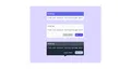
Tooltips provide additional information upon hover or click, it is use Tailwind CSS to create this beautiful tooltips tailwind component.
tooltips
Loading component...
59 lines
<section class="flex items-center justify-center">
  <div class="items-center py-24 bg-purple-200 min-h-screen min-w-full space-y-8">
    <div class="flex flex-col items-center">
      <span
        class="relative z-30 text-sm leading-none font-medium rounded text-gray-600 whitespace-no-wrap bg-gray-50">
        <h1 class="p-3 bg-indigo-500 rounded-t text-gray-100">Heading</h1>
        <p class="py-3 px-2">Clear and consisce tooltip message here!</p>
      </span>
      <div class="w-4 h-4 -mt-2 rotate-45 bg-gray-50"></div>
    </div>
    <div class="flex flex-col items-center">
      <span
        class="relative z-30 text-sm leading-none font-medium rounded text-gray-600 whitespace-no-wrap bg-gray-50">
        <h1 class="p-3 rounded-t text-gray-600">Heading</h1>
        <p class="py-3 px-2">Clear and consisce tooltip message here!</p>
        <div class="flex-row md:flex items-center float-right mr-2">
          <div class="sm:space-x-2 my-3">
            <button
              class="modal-close px-2 py-1 bg-gray-300 rounded-lg text-gray-600 text-sm hover:bg-gray-800  hover:text-gray-100 focus:outline-none dark:hover:bg-gray-100 dark:hover:text-gray-800">
              Learn More
            </button>
            <button
              class="modal-close px-2 py-1 bg-indigo-600 rounded-lg text-gray-200 text-sm hover:bg-indigo-700  hover:text-gray-100 focus:outline-none dark:text-gray-100 dark:bg-gray-600 dark:hover:text-gray-50 dark:hover:bg-gray-700">
              Got it!
            </button>
          </div>
        </div>
      </span>
      <div class="w-4 h-4 -mt-2 rotate-45 bg-gray-50"></div>
    </div>
    <div class="flex flex-col items-center">
      <span
        class="relative z-30 text-sm leading-none font-medium rounded text-gray-600 whitespace-no-wrap bg-gray-800">
        <h1 class="p-3 rounded-t text-gray-50 bg-gray-600">Heading</h1>
        <p class="py-3 px-2 text-gray-200">Clear and consisce tooltip message here!</p>
        <div class="flex-row md:flex items-center float-right mr-2">
          <div class="sm:space-x-2 my-3">
            <button
              class="modal-close px-2 py-1 rounded-lg underline text-gray-300 text-sm hover:bg-gray-800  hover:text-gray-100 focus:outline-none dark:hover:bg-gray-100 dark:hover:text-gray-800">
              Learn More
            </button>
            <button
              class="modal-close px-2 py-1 bg-indigo-200 rounded-lg text-gray-800 text-sm hover:bg-indigo-800 hover:text-gray-100 focus:outline-none dark:text-gray-100 dark:bg-gray-600 dark:hover:text-gray-50 dark:hover:bg-gray-700">
              Got it!
            </button>
          </div>
        </div>
      </span>
      <div class="w-4 h-4 -mt-2 rotate-45 bg-gray-800"></div>
    </div>
</section>

<style>
  @import url('https://fonts.googleapis.com/css2?family=Fira+Mono:wght@400;500;700&display=swap');

  body {
    font-family: 'Fira Mono', monospace;
  }
</style>